Page 2 of 19
Posted: Sun Sep 24, 2006 7:00 am
by :FI:Falcon
Does this help?

Four general techniques used individually or in combination to add structure, detail, definition, etc. to skin.
F
PS: Love dah sheeps!
Posted: Sun Sep 24, 2006 7:11 am
by :FI:Snaphoo
Does this help?
Yes! Mucho... I'll work on that tomorrow... now, I'm about to fall asleep on my keybooooooooooooooooooooooooooooooooooooooooooooooooooooooooooooooooooooooooooooooooooooooooooooooooooooooooooooooooooooooooooooooooooooooooo...
snk! <gasp>
...
Err... night!
Snaph.
Posted: Sun Sep 24, 2006 7:20 am
by :FI:Sneaky_Russian
Quote:
This design might need some definition around the wing/fuselage transition area though. It might just be the detail you lose when you convert the pick to a .jpg and then shrink it, but you may need some more ... clarity? around the wing roots to deliniate wing from fuselage. Now, it kinna looks like a green blob.
Maybe some sllliiightly bolder lines at the root or maybe a lighter or darker set of fairing panels?
You see what I'm sayin'?
Maybe a copy of the detail layer (@ 100% opacity to start), touch up with erase brush set @ say 12% opacity to fade out areas where definition is OK. Could use retouch brush in "darken" mode.
Look at other templates for clues e.g.
Highlights
3D layer
lighting effects
etc. for further enhancement (kind of 3D rendered "trompe loi")
Will probablyrequire some trial and error/patience since you dont get to see the final result till you load the skin in game.
(A 3D skin viewer utility? now wouldnt that be great!)
Posted: Sun Sep 24, 2006 7:23 am
by :FI:Falcon

Just remember, the key word is subtilty, especially for colors, highlights, graphics and some detailing and shadows. If it looks good at say ... 75% opacity, try it at 70%.
Still looks good? Try 65%.
Still getting a good effect? Try 50%.
Still could work a little lighter? Try 25%, 5%.
Oops, too much? Creep it up a little.
Falczzzzzzzzzzzzzzzzzzzzzzzzzzz ..............
Posted: Sun Sep 24, 2006 8:41 am
by :FI:Noter
Here's my Corsair, I took some liberties and put the Jolly Rogers on it, if it's too much let me know. I really like the look and thought it was kinda neat to add. My skins have been "flown", I can scale back some of the wear, but for the most part nothing looks like it came off the line.
Nearly 4 am and I'm skinning, what is wrong with us...skinner's we're all mad, mad I say...MMMuuuuuaaahhhhaahahahahh
Noter


Nice.
Posted: Sun Sep 24, 2006 9:22 am
by :FI:Sneaky_Russian
But would suggest that deaths head logo would work better on an all black plane.Maybe Ire green fin with jolly roger in black circle with orange outline.
I'd be interested to see this with a green tailfin .
Also suggest small fuselage roundel aft of diagonal orange band.
Would like to see closer colour match on band to orange of rounds.
Am I too picky?
Posted: Sun Sep 24, 2006 2:47 pm
by :FI:Noter
Not at all mate...that's why we are doing this.
I tried the band with roundel not overlapping on the fuselage, but to me it didn't work as well, but I can give it a another try.
I also thought about the bands being orange, but wasn't sure if that might be too much organge, thought it might be nice to use some different colors besides the green white and orange.
I will play with the tail a bit as suggested.
Noter
Posted: Sun Sep 24, 2006 3:32 pm
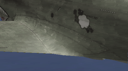
by :FI:Falcon
Noter,
Kool skin. Don't worry about too many paint chips and wear. Most of the degenerates here like'em as beaten up as they can get'em!
I like the roundel over the band but share the opinion that all gold/orange should match.
Great smoke and dirt under belly.
Did you have fun puttin' those numbers on the gear doors?
The wear on the wing is wonderful, but it doesn't match the wear right next to it on the fuselage near the cockpit area.
Have you been trying the texture layers?
I like the black tail accent, but duuuude, can't you fine a graphic of a sheep's skull?!?!


I like the tail hook too.

Right, that's enough strokin' an' pokin' ...
get back to work!
F
Posted: Sun Sep 24, 2006 4:39 pm
by :FI:Noter
Good suggestions as well Falcon, I will do a little more pokin at some references and see about wear along the fuselage next to the root.
Also like the sheep skull idea.
I have the texture layers you did, but I didn't use them on this, I used the RGB numbers you did and matched those. I still have some dilema going from a mac monitor to a pc and how it looks to others. Is the green ok?
Noter
Posted: Sun Sep 24, 2006 4:53 pm
by :FI:Falcon
:FI:Noter wrote:... Is the green ok?
Noter
I think it looks great and is a viable addition to the other greens we're making,
but without a texture layer or maybe a gray layer it looks lighter and smoother than the ones Snaphoo and I are making.
That's fine, but if you can explore the world of layers it might prove fruitful.
I forgot again. do you use PS or PSP? What's the problem with a Mac monitor? I don'unnerstang.
I really miss graphics on my old Mac. Now I hear that Apple's Windows enabler is fully operational and good for games now. I miss my Mac.
F
I-16, Yak and MiG ready-ish
Posted: Mon Sep 25, 2006 3:15 am
by :FI:Snaphoo
This is about as accurate as I can get with this one... and I hope it works, because other than toning down/up the dirt layer, this is as good as it gets for me...
This was a Rat, in more ways than one, as Falcon said....
I-16:
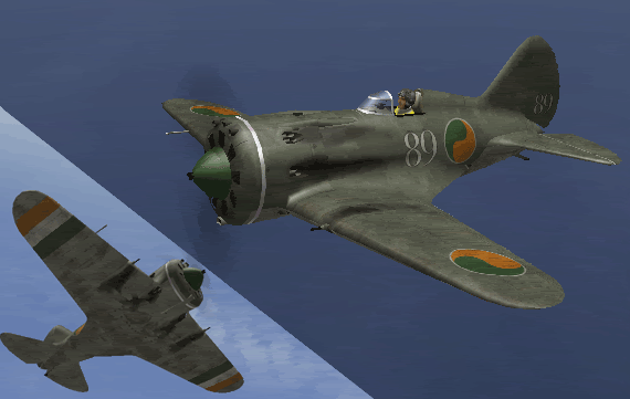
Yak:
MiG:
I will try to work on a chip layer for the Yak and the MiG, but does anyone know if the MiG (at least the early models) were part cloth? Do I need to come up with a cloth wear layer?
Comments? Suggestions? Questions?
Oh yeah Falcon, does this look like what you were talking about on the P-40?
If not then let me know, I just saw that I got it close, and thought I'd ask before I went too far...
Snaph.
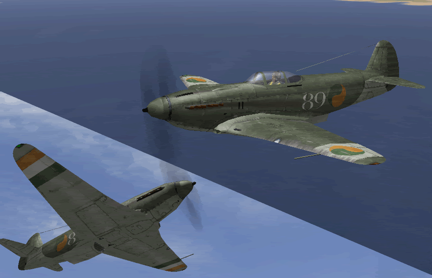
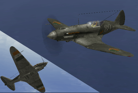
Posted: Mon Sep 25, 2006 5:09 am
by :FI:Falcon
Looks peachy keen Jake!
Is that a Yak 9?
Yeah, the wing looks better. How do you think it looks if you move back a bit ... still enough?
I'll check my data base on the construction of the MiGs. I think it was at least slightly different than the LaGG's and Yaks.
Jumping the gun a wee bit ...
here's the Spitfire Vc.

It needs a little more wear here an' there and then will be finito.
Falcon
My contribution
Posted: Mon Sep 25, 2006 10:39 am
by :FI:Genosse
Hi, folks!
As Falcon mentioned it yesterday I haven´t been quite interested into this topic so far. Well, actually I like the idea of using squadron skins but I´ve been too busy with other things (family, working, RL friends, Lock On, BF2) that I haven´t followed this thread with all its pictures and ideas you´ve already placed here mindfully. I do apologise my apathy ...

Anyhow, here´s my first contribution to our squadron skins: the Fiat G50 kept in
IreGreen colour with the work title 101. Whaddya think about it, folks?
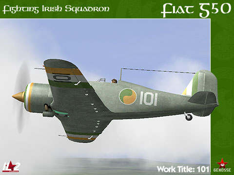
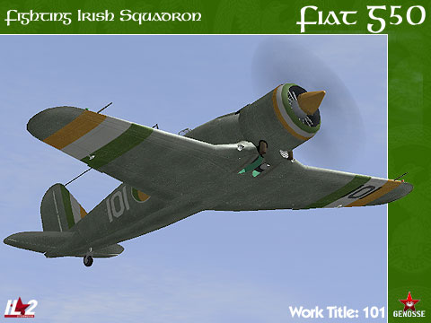
My next project will be the Fiat CR42 ...
Cheers, chaps!

Posted: Mon Sep 25, 2006 2:00 pm
by :FI:Falcon
I always luv all your stuff Frankosse.
You have a great feel for design and artistry,
and your presentation is always excellent.
But now I get to tell you what people are always nagging to me ...
more paint chips and dirt, man!
And thanks for doing one of the more obscure planes,
all we Prima donnas just want to do the flashy planes first.
Fal "Flashy" con
Posted: Mon Sep 25, 2006 5:08 pm
by :FI:Bluebell
All of them are great, and yep, we like 'em beaten up looking(royal we probably).
Vin