:FI:Sacktime wrote:... I can't get any better with out some constructive criticism. ...
Nononono....no!
The way you get better is do 10000 skins and find your own techniques.
But this first skin is WAAAY better than my first try.
~ You don't want to see it. ~
Study more templates.
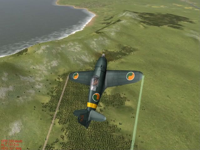
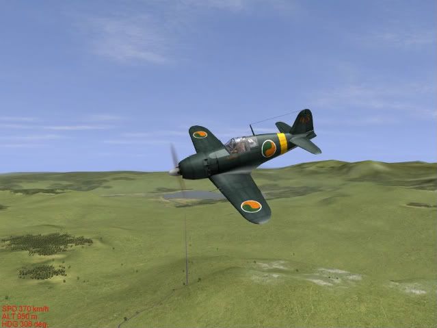
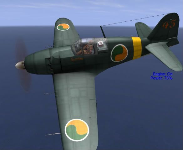
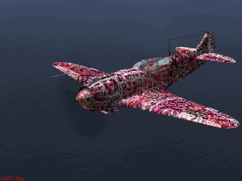
Your lines and line blurs underneath seem much darker than those on top because of the light/medium gray under-paint background. Make separate layers for lines, rivets, hatches, etc that will be in areas of significantly different colors to adjust them appropriately.
Best advise I can give is to make opacity your friend. If it looks good, lower the opacity 10-15% and see if that looks better. Still okay? Lower it some more. That will help paint look more realistic, lighter and those rounds less like plastic stickers.
Oh yeah, and what my design teachers learn-e-ated me in school:
-less is more.
-Dog is in the detail.
Keep-ah goin'! Lookin' good!
Falcon
PS: ... and yeah, that criticism thing is good too.

"He who warned, uh, the British that they weren't gonna be takin' away our arms, uh, by ringing those bells, and um, makin' sure as he's riding his horse through town to send those warning shots and bells that we were going to be sure and we were going to be free, and we were going to be armed."
- The history of Paul Revere's
midnight ride, by Sarah Palin.